 I was aware that the decision of my font was important, as each font has completely unique connotations. Especially with our Film Noir sub-genred thriller, when a suitable font (1930's style) is difficult to find. We actually managed to find a number of suitable simplistic fonts which we were aware may work well within the contents of our thriller. Yet the one we found to be most effective was 'Belta Regular' - it was simplistic yet stylish, it emphasised the glamorous and stylistic aspect of the beginning yet was not over exaggerated or too much. I couldn't think of another film which used the same font either, which was promising due to the fact that often films are associated with the fonts used and that is partially how they are remembered.
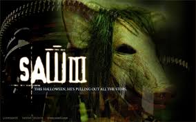.jpg) Such as the 'Saw' films, the font is so unusual and iconic that when the audience think of the film, often that font comes to mind. It sticks in the audience's head, especially due to the slightly haunting aspect of it. In this case our font is disimilar, it is not haunting nor outrageous yet is extremely simplistic - it simply fades onto the screen for a couple of seconds and fades off. This in itself presents an eerie feel, as if the situation is delicate and fragile therefore anything could happen. The use of it placed in empty space throughout the shots also emphasizes this, the font is so subtle that with a blink it could be missed - therefore the audience must pay attention since some of the fonts appear in slightly unusual places in unusual angles. This presents the idea that boundaries shall be broken or that the film will not be fully conforming to the Film Noir genre, a suggestion that the audience may be surprised which will provide interest from the audience.
Such as the 'Saw' films, the font is so unusual and iconic that when the audience think of the film, often that font comes to mind. It sticks in the audience's head, especially due to the slightly haunting aspect of it. In this case our font is disimilar, it is not haunting nor outrageous yet is extremely simplistic - it simply fades onto the screen for a couple of seconds and fades off. This in itself presents an eerie feel, as if the situation is delicate and fragile therefore anything could happen. The use of it placed in empty space throughout the shots also emphasizes this, the font is so subtle that with a blink it could be missed - therefore the audience must pay attention since some of the fonts appear in slightly unusual places in unusual angles. This presents the idea that boundaries shall be broken or that the film will not be fully conforming to the Film Noir genre, a suggestion that the audience may be surprised which will provide interest from the audience.The pure white font is almost sinister since it is so pure and simple that the audience can almost predict that the plot will not end quite so glamorously. The white mixed with the flickering candle light behind in this shot, also is symbolic of heaven aka death. Therefore from one of the primary shots the audience may be made aware that the plot will take some kind of sinister turn, the suspense of this creates an interested audience.
No comments:
Post a Comment