Below is the image of a research poster which we created, based on the opening of 'Casino Royal' and how it uses conventions of Film Noir. We commented on shot types, camera angles, costume, lighting, mise-en-scene etc.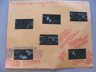

 I was aware that the decision of my font was important, as each font has completely unique connotations. Especially with our Film Noir sub-genred thriller, when a suitable font (1930's style) is difficult to find. We actually managed to find a number of suitable simplistic fonts which we were aware may work well within the contents of our thriller. Yet the one we found to be most effective was 'Belta Regular' - it was simplistic yet stylish, it emphasised the glamorous and stylistic aspect of the beginning yet was not over exaggerated or too much. I couldn't think of another film which used the same font either, which was promising due to the fact that often films are associated with the fonts used and that is partially how they are remembered.
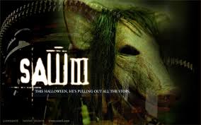.jpg) Such as the 'Saw' films, the font is so unusual and iconic that when the audience think of the film, often that font comes to mind. It sticks in the audience's head, especially due to the slightly haunting aspect of it. In this case our font is disimilar, it is not haunting nor outrageous yet is extremely simplistic - it simply fades onto the screen for a couple of seconds and fades off. This in itself presents an eerie feel, as if the situation is delicate and fragile therefore anything could happen. The use of it placed in empty space throughout the shots also emphasizes this, the font is so subtle that with a blink it could be missed - therefore the audience must pay attention since some of the fonts appear in slightly unusual places in unusual angles. This presents the idea that boundaries shall be broken or that the film will not be fully conforming to the Film Noir genre, a suggestion that the audience may be surprised which will provide interest from the audience.
Such as the 'Saw' films, the font is so unusual and iconic that when the audience think of the film, often that font comes to mind. It sticks in the audience's head, especially due to the slightly haunting aspect of it. In this case our font is disimilar, it is not haunting nor outrageous yet is extremely simplistic - it simply fades onto the screen for a couple of seconds and fades off. This in itself presents an eerie feel, as if the situation is delicate and fragile therefore anything could happen. The use of it placed in empty space throughout the shots also emphasizes this, the font is so subtle that with a blink it could be missed - therefore the audience must pay attention since some of the fonts appear in slightly unusual places in unusual angles. This presents the idea that boundaries shall be broken or that the film will not be fully conforming to the Film Noir genre, a suggestion that the audience may be surprised which will provide interest from the audience. Prezi was a particularly good piece of technology since it enables so much flexibility in the form of presentation. Without prezi there would be no oppurtunity to create any research/work in such a flexible and creative way, since it creates such a fluid and modern way of presenting information. It is one of my favourite forms of presenting due to the oppurtunity to embed a variation of images and add a unique design and various pieces of font to create an interesting presentation.
  During both research and evaluation, YouTube played a vital part. YouTube provided such easy access to such a wild variety of film clips or trailers, which enabled us to gather information and connotations of a film in a very short space of time. It also meant that we did not have to go out and buy a variation of DVD's in order to carry out research, which before technology developments would of quite obviously been the case. We were able to upload and therefore share our thriller's in a viral manor. It also meant that we were able to freeze the thriller on a particular shot, giving me the ability to point out a variation of connotations and denotations of that shot, which otherwise would be difficult to talk about and therefore detail may be missed out. It also shows digital literacy to possible future employers/university's when these video's and multi-media products are embedded within a blog.
 'Dafont.com' produced a huge range of fonts for a variation of purposes, we found many fonts that especially suited to a Film Noir style (that would otherwise of been very rare to find). We then had a selection of possible fonts to use, so had the ability to swap them around in order to see which was the most appropriate.


 In terms of footage, I found it very simple to catergorise film clips, select those to particular folders and then select the strongest of clips from those. With 'Scarlett' from primary planning, I was aware that I strongly wanted the thriller to be edited into black and white to truly fall into the Film Noir genre. I had an idea of huge buildings and slightly dimly lit alleyways, glamorised by a simple yet stylistic greyscale effect. Due to this editing software this was able to happen, yet I was also to view exactly what it would look like in colour.
